Project Overview:
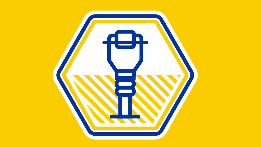
Set out to design a cohesive set of app icons for Clyde Companies internal portal, Clyde Portal, a vital tool used by employees across multiple subsidiaries including, Sunroc, Sunpro, Geneva Rock, WW Clyde, Bridgesource, Clyde Capital Group, and Beehive Insurance. The goal was to create a clear, functional, and visually consistent icon system that enhanced navigation and usability within their portal, ensuring an intuitive user experience that felt unique to Clyde Companies.
Objectives:
• Develop a consistent and scalable icon set that meshes well with with Clyde Companies’ brand identity.
• Design for both light and dark modes to optimize visibility across different users.
• Maintain a modern, professional, and clean aesthetic that enhances usability.
• Ensure the icons effectively represent various functions, tools, and services used within internal systems.
• Design for both light and dark modes to optimize visibility across different users.
• Maintain a modern, professional, and clean aesthetic that enhances usability.
• Ensure the icons effectively represent various functions, tools, and services used within internal systems.
